8 Apples

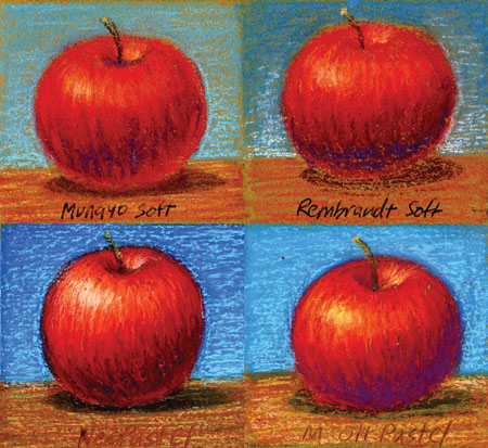
Before I proceed I wanted to compare media sided by side to see what I liked better. Not only how it looks but how I liked working with it.

The Top two are the most popular Hard Pastels Cont’e Crayons and NuPastel. The NuPastel’s Red was more pinkish and the darks aren’t as dark. The Cont’e is more brilliant, less waxy. The Carbothello Pastel Pencils was the most brilliant, which surprised me because it’s the hardest, harder pastels contain more binders. Pencils are much easier to use too, sticks don’t always land on the paper where you expect. The Semi-hard would make a nice underpainting for soft pastel.

Out of the two soft pastels I have, Mungyo and Rembrandt are very similar, I would like to try Sennelier’s soft. Of the Oil pastels, NeoPastel and Mungyo Gallery, the Neo’s are slightly more brilliant, if one pushes hard the Mungyo’s are more likely to leave crumbs on the paper.

Conclusion: For illustration I’m leaning toward Carbothello’s for the precision of the pencil and intensity of the color, if I used any of the other pastels I would have to make the illustrations bigger. I like the Cont’e crayon for life sketching and drawing, because it’s broad but still precise with the square stick. Between the soft pastel and oil pastel, I like the looks of the oil pastel, to me a bit bolder and I like making marks with it.

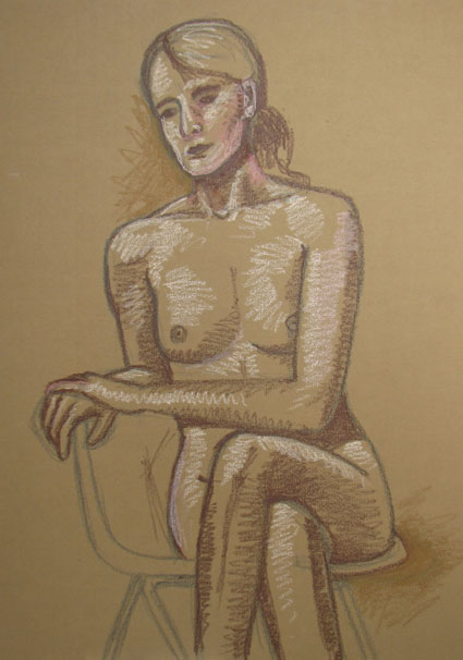
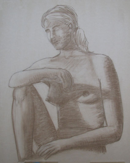
New Live Female Nude (WIP)

Our Life Drawing Drawing Group didn’t meet for 3 weeks because of conflicts, but we finally did last night. I really missed it. I enjoy the challenge and the company of other artists. This is a rough in of the lightest and darkest areas of the figure. Next sitting I will go and fill in the color without the model. I tried Sennelier Oil Pastels, they’re smoother, and softer. I am interested to see how it comes out in full color. Strathmore Brown Paper, 18×24″

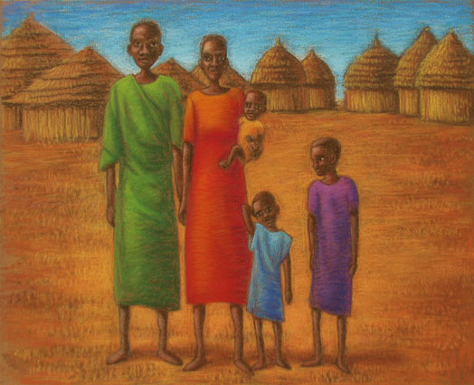
Sudanese Family (Color)

I put the family in the proper village. I love these huts! Ideally it should be populated in the background, but this gives me a chance to try methods. I have yet to find a picture of one with a door, are they hard to see? Anyway, this is hard pastel and pastel pencil on brown Strathmore Brown Pastel Paper. I like the pastel pencils, they are Carbothellos, they are nice for small details like on the people. I think it would be best to have them sitting so they can be bigger in the picture. I still don’t know if the pastel paper is the best way to go, or use watercolor underneath. I have to find a smooth watercolor paper with enough tooth for pastel.

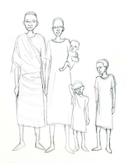
Sudanese Family (WIP)

I searched the web for Sudanese Art. I want to try a more stylized approach. I like the elongated figures, expressive features, and all of the color. I incorporated this into my concept sketch of a family (I will need a larger family but this is a test). Next I will do color rendering with a village behind them.

Sudanese Portrait

I will be working on illustrations for a children’s book about a Sudanese boy who comes to America through many trials. As a first step, I wanted try different methods of working. As a test, I did a portrait with watercolor under hard pastel. I used a 140lb Arches paper on a block, sanded to work better with pastel. I would like to find a smoother paper, it has a rougher look than I would like. I’m also going to test pastel paper without using watercolor.

Landscape Design in Pastel

I was able to make bold bright strokes over the faint color I blocked in, except the yellow and gold on the hay bails doesn’t have the pop that I would like it to, but I’m happy with the sky. I will play some more this week, experiment with different brands and effects.

Designing a Landscape

I thought oil pastel might be useful for designing a landscape to be painted on a larger scale. For working out composition and color issues. I’m also hoping the painting might pick up some of the rhythm and movement from the marks in the pastel.

Brown paper is a good neutral for landscapes, like the dirt is already present underneath. I drew rough line in umber oil pastel of my landscape.

Next I faintly blocked in the midrange tones for the composition, deliberately not committing to any bold marks at this point. Tomorrow I will put in the bold marks and post the final if all goes well.

Oil Pastel Test

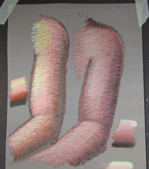
I wanted to compare a softer brand of oil pastels. The left is what I used for the last pose of the girl, Neopastels. At the right is Sennelier’s Oil Pastels. The Sennelier’s are only darker, because they’re the only colors I have at the moment. Senneliers blend more readily and look softer and fill more holes in the paper. For the purpose of rendering figures, that is what I want.

On this test I wanted to try soft on top of hard, to rough in with the Neopastels, and finish with the Sennelier’s. A is step 1, B is Step 2.
That worked well. It allows the ability to rough it in and make changes, and once satisfied to put on the finishing layer without creating a muddy mess. I will try the Sennelier’s at life drawing group once a better selection of colors in my tool box.

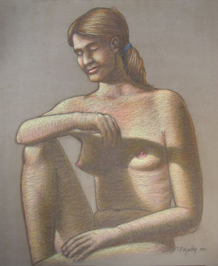
Live Female Nude (WIP)

At one point I almost through this one out the window! I drew it at larger scale, and wasn’t sure if my proportions were right, because I couldn’t see what I was doing. I had sanded the paper for oil pastel, but since I thought it was a lost cause, I just took a regular dark pastel and shaded it. The surface was too smooth for regular pastel, and it made for stark shading. Worse after seeing it shaded I could see that the drawing was solid. Tomorrow I will attempt to ressurect it with oil pastel. Will oil pastel cover it?