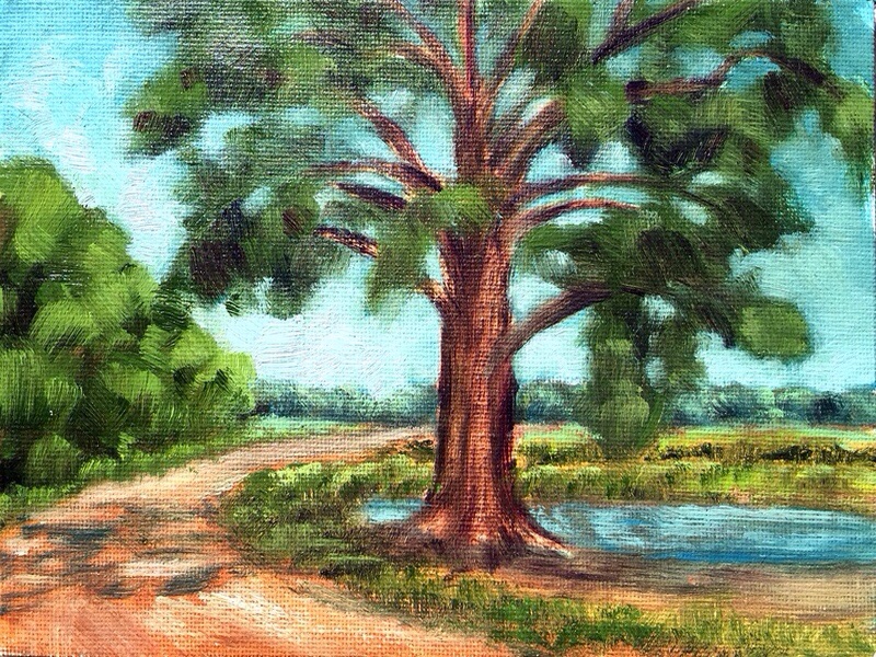
Today I put the foreground in on this painting. Slopped on as much paint as I could!
8×10″ stretched canvas with gallery edges.
Today I put the foreground in on this painting. Slopped on as much paint as I could!
8×10″ stretched canvas with gallery edges.

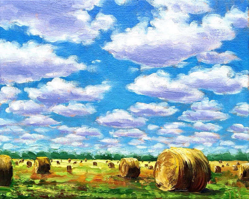
“Rolling Up the Carpet” is the name I give for paintings of hay bails, although the sky is always of big interest to me in pictures of the plains. From our house we have a wide open view of the Southern sky. I’m especially watchful when thunderheads are developing.
8×10″ stretched canvas with gallery edges.

Since I have a cold, and didn’t feel like standing up to an easel, I decided it was time to give IPad painting a try from my comfy couch. I have tried out other paint programs, but was never completely content. I was inspired by the work of Janette Leeds of http://artandwordsjanetteleeds.com to try “Art Set Pro” on the iPad.
This painting is the same subject as one I did with real paint, except this time I did it from memory. It was the first thing that popped in my head. Clouds are one of my test subjects for new media. I use to make apples.
I found it was much like the real painting experience. I can paint somewhat like I do with real paint. I even picked some of the colors off a photograph of one of my paintings to get just the colors I use.
In many cases it’s nice to have the original painting, but I can see a real advantage for illustration, like a picture book. It comes out much better than a scan of a painting. Keeping consistency in colors through many pages would be easier. A print quality at 8×10″ 300 dpi can be achieved. I think I could go a little bigger.
There is also the advantage of spontaneous play and doodling, and knowing that you aren’t wasting materials. I could use it like an oil sketch for planning big paintings too. It’s just good fun!
Thanks Janette!
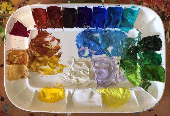
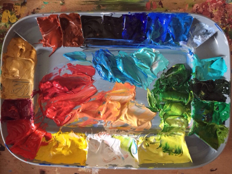
It’s time to start fresh with a new palette. Since I have two of theses Mijello palettes now. I’m keeping this one just for landscape. I may never have to clean it again! We’ll see how that works out. I mixed the major colors I use. Then I will grab as needed and let it mix together on painting, or grab two colors at a time.
Here is a list of my preferences:
Essential palette colors- Colbalt Blue, Sap Green, Green Gold, Cadmium Yellow Medium, Titanium White, Yellow Ochre, Burnt Sienna, Quinacridone Magenta
Extras- Ultramarine Blue, Cerulean Blue, Teal, Green Medium, Cadmium Yellow Primrose, Naples Yellow Lt, Red Oxide, Van Dyke Brown
I’m not one of those limited palette kind of people! 😀 To each his own!
6×6″ stretched canvas gallery edge.
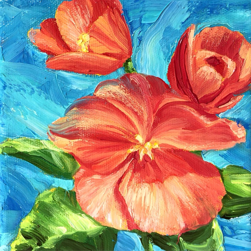
I’m enjoying Spring and the flowers it brings! It doesn’t hurt to use up the Reds that I mixed either! I hope your able to stop and smell the flowers!
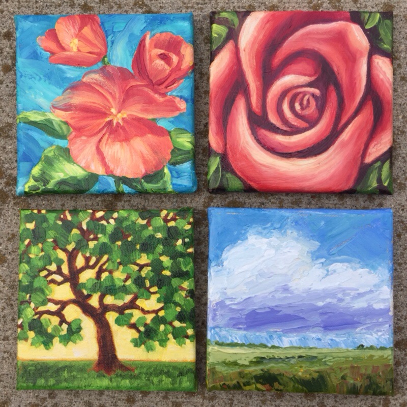
Our local Art Center http://brookingsartscouncil.org/home hosts an exhibit to raise funds by asking local artists to create up to 4 of 6×6″ works of art of any media. Patrons buy as many chances for a drawing as they like. At the time of the sale, they draw tickets, and each person comes up as their ticket is drawn, and has 30 seconds to pick a painting. The paintings are only signed on the back, so you have to pick by taste, instead of by name.
Here are two paintings I picked out at the last sale, painted by my friends. I can recognize their work, but I picked them because I liked the pictures.
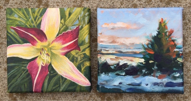
Painting on left by John Rycharik, and on right by Steve Randall. Thanks guys, I’m proud to own art by your hand!
AFTER
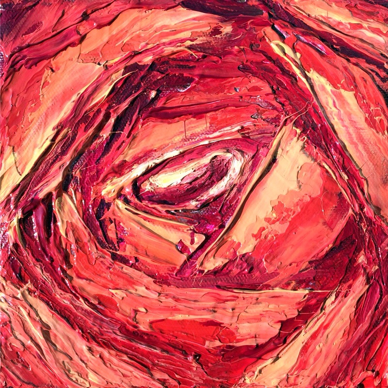
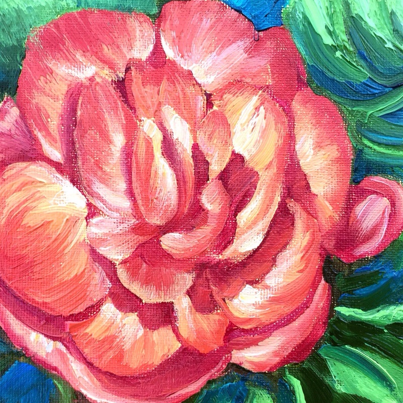
This palette knife painting represents a rose from memory. In the BEFORE version I was satisfied with the composition, but not the colors I don’t know why I use the dull brown. Anyway, I looked at it today by chance, and thought I want to fix this. The texture has a bit different effect covering over the top of existing texture but I’m glad I went for it! I may try this again from scratch sometime.
BEFORE
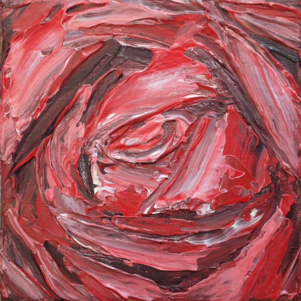
6″x 6″ gallery edge stretched canvas
Recently I decided to start a fresh palette. The old one was maintained for over a year. The Golden Open Acryics along with a sealed palette like Mijello, if refreshed with new paint when needed make that possible. It works because the paint slowly thickens instead of skinning over. I recently bought a gray palette, which is a great neutral backdrop. I still have my white one, I’m letting it dry completely so I can easily peal off the old paint. I will keep them both going.
On my easel today is a painting of Begonias, stirred into action by the Spring fever I’m feeling. 6″x6″ stretch Gallery Wrap Canvas.
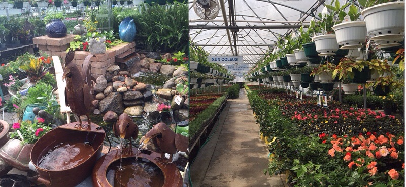
One thing I look forward to every Spring is my first trip to Medary Acres, our local Nursery. This is where I went looking for my subject.
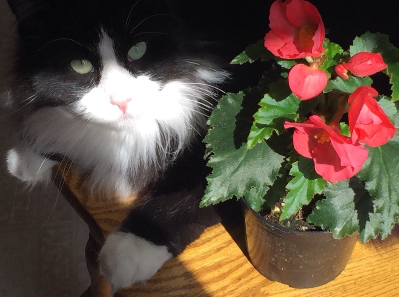
Posing with my subject is a persistent Merlin the Cat. I’ve just decided he should be the star of a new painting, coming soon!
THE AFTER
I was looking through my shelf of rejected canvas boards, and saw one I thought I could rework over the top of the existing painting. I believe it was done in Watersoluble Oils. I used those oils just to be on safe side. I don’t really have medium to mix with it that I like to make it tackier. The strokes blend together much too easily. It was a struggle.
Above is the After, Below is the Before. 6″x 8″.
THE BEFORE
THE SHELF OF REJECTS
Shouldn’t be too surprising that I have a shelf of rejects! Do you have a painting that could use a makeover? I would enjoy seeing and hearing about yours!
'Art should serve a purpose other than itself.' Kath Kollwitz. 'Painting is drawing on canvas and engraving is drawing on copper and nothing else. Drawing is execution and nothing else'. (Blake,c.1809)
Wildlife and Travel Photography, Filming and Production, News
Discovering the joy of art
Exploring the 'Everyday' through Art.
Kunst- und Projektraum / Mommsenstrasse 8, 10629 Berlin
The journey of being an artist.
Dawn A. Grider Art Able - Artist and Private Art Teacher
Emma's Art and Artistic Explorations
Born a Yaad | Adventuring Abroad™
Submit the first 10 pages of your script, get feedback from professionals, and get your screenplay performed by professional actors. At least 2-5 winners every single month.
We’re just inviting you to take a timeout into the rhythmic ambiance of our breakfast, brunch and/or coffee selections. We are happy whenever you stop by.
Just your average PhD student using the internet to enhance their CV
Poetry by Valeria Castellanos
Showcasing the best of female talent. Filmmakers and Screenwriters
Writing, Books & Authors News
God, Sant Kirpal Singh Ji, Dr. Harbhajan Singh, Biji Surinder Kaur, Kirpal Sagar, Unity of Man, Spirituality, Love, Compassion, Peace, Non-Violence, Right Understanding, Consciousness, Togetherness, Religions, Mind, Maya
