Rolling Up the Carpet #9 (Actual Final)

image

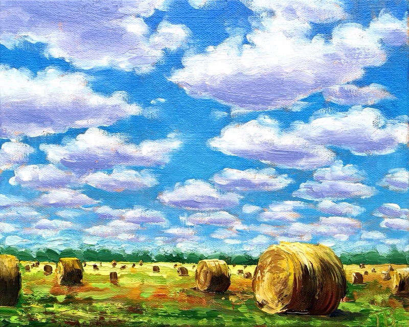
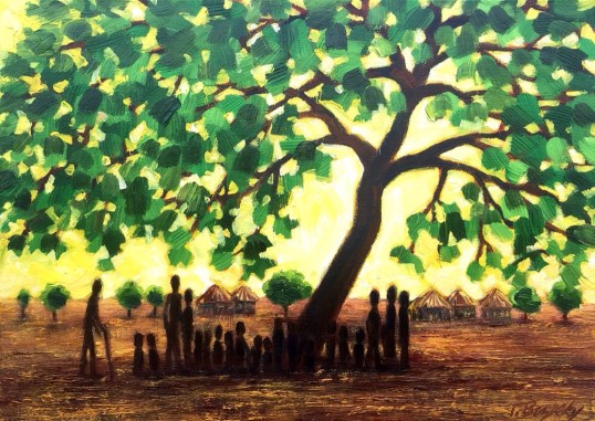
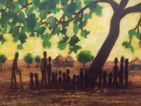
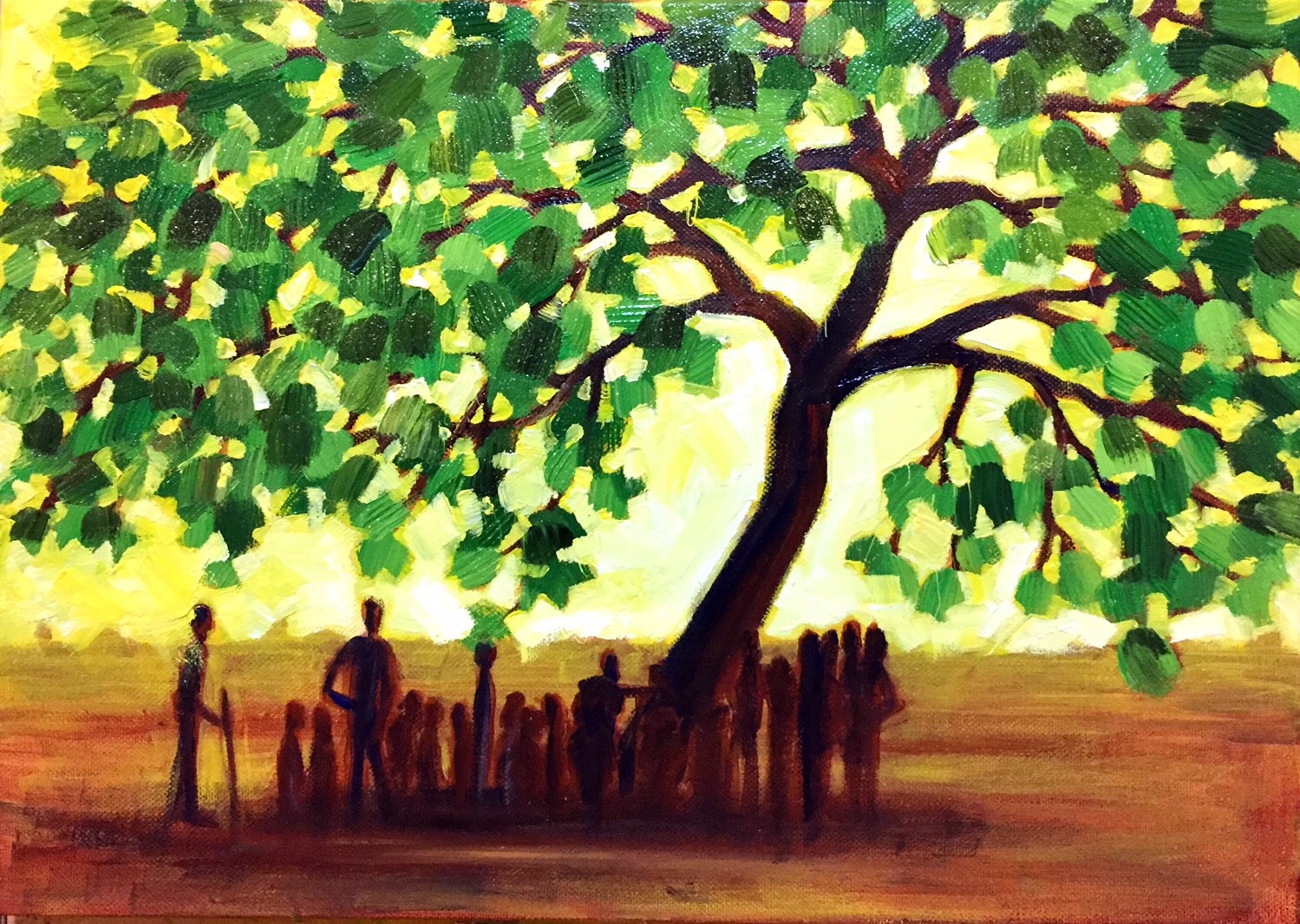
Veil of humidity in “Rolling Up the Carpet #9”

At the horizon this picture needed something. It is commonly accepted that at the horizon there should be a fall off of colors, a veil of humidity to some degree, whether it is really there or not to add perspective and mood. I didn’t subdue the trees in the shelter belt enough. Here in the Northern Midwest, we don’t see it very often, and it was not present here, but I feel the effect should be added. The whole picture shouldn’t have the same intensity.
Just about everytime I’ve done Plein Air Painting, I’ve had to improvise on this effect. Our air is very clear! If I went southeast this wouldn’t be a problem.

Rolling Up the Carpet #9 (WIP 2)

image

Today I put the foreground in on this painting. Slopped on as much paint as I could!

8×10″ stretched canvas with gallery edges.

Fresh Landscape Palette 003

image

It’s time to start fresh with a new palette. Since I have two of theses Mijello palettes now. I’m keeping this one just for landscape. I may never have to clean it again! We’ll see how that works out. I mixed the major colors I use. Then I will grab as needed and let it mix together on painting, or grab two colors at a time.

Here is a list of my preferences:

Essential palette colors- Colbalt Blue, Sap Green, Green Gold, Cadmium Yellow Medium, Titanium White, Yellow Ochre, Burnt Sienna, Quinacridone Magenta

Extras- Ultramarine Blue, Cerulean Blue, Teal, Green Medium, Cadmium Yellow Primrose, Naples Yellow Lt, Red Oxide, Van Dyke Brown

I’m not one of those limited palette kind of people! 😀 To each his own!

A Bloomin’ Begonia

image

6×6″ stretched canvas gallery edge.
I’m enjoying Spring and the flowers it brings! It doesn’t hurt to use up the Reds that I mixed either! I hope your able to stop and smell the flowers!

Painting Makeover 02

AFTER
image

This palette knife painting represents a rose from memory. In the BEFORE version I was satisfied with the composition, but not the colors I don’t know why I use the dull brown. Anyway, I looked at it today by chance, and thought I want to fix this. The texture has a bit different effect covering over the top of existing texture but I’m glad I went for it! I may try this again from scratch sometime.

BEFORE
"Painting the Roses Red"

6″x 6″ gallery edge stretched canvas

Today’s Fresh Palette 02

image

Recently I decided to start a fresh palette. The old one was maintained for over a year. The Golden Open Acryics along with a sealed palette like Mijello, if refreshed with new paint when needed make that possible. It works because the paint slowly thickens instead of skinning over. I recently bought a gray palette, which is a great neutral backdrop. I still have my white one, I’m letting it dry completely so I can easily peal off the old paint. I will keep them both going.

Spring Brings Begonias

image

On my easel today is a painting of Begonias, stirred into action by the Spring fever I’m feeling. 6″x6″ stretch Gallery Wrap Canvas.

image

One thing I look forward to every Spring is my first trip to Medary Acres, our local Nursery. This is where I went looking for my subject.

image

Posing with my subject is a persistent Merlin the Cat. I’ve just decided he should be the star of a new painting, coming soon!

“School Under the Trees” Final


I finished “School Under the Trees” this afternoon. 12″x16″ acrylic on stretched canvas. Will be auctioned to help raise money to build a school in South Sudan.


Detail of foreground.

“School Under the Trees” WIP2

image

I painted the tree, the most challenging part of the painting. Painting the holes to shape the negitive space of the light coming through the trees is the final step of this part.

image

Here is part of the detail.

Warm Vs. Cold WIP2

image

image

1st is the blue underainting, 2nd is the red. The flower is not finished and I will do other adjustments. However subtle, even with opaque media there is a difference.