IPad Plein Air on the Beach

image

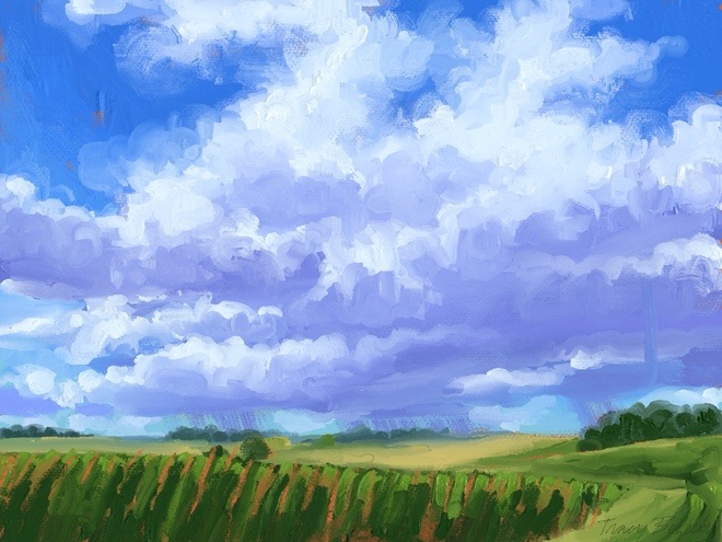
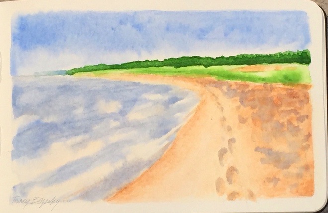
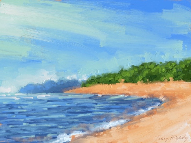
I’ve been on vacation. At this time, we were exploring the Keewenaw Peninsula around Lake Superior in Michigan. It would be a great opportunity for Plein Air painting, but I’m with family and we’re always on the move. I thought to squeeze it in while we were sitting on the beach, but the only option was my IPad. This would be great if not for sunlight’s glare on the screen. I used Art Set Pro on my IPad with a brush stylus. Fortunately I had colors picked for landscape on my palette. I made some revisions after I got inside. I considered it a worthwhile exercise. I’m heading home today.

Storm on the Horizon – Restart Underpainting WIP02

image

I’m on vacation a good part of July, but back at home at the moment. I went to make adjustments on my underpainting of the first version, and realized the lightly textured board was probably not going to be to my liking for this. Here is a redo of my underpainting on stretched canvas 18″x24″ I like the new composition better, I wanted more sky,a bigger storm cloud, and a lower horizon.

Watercolor of Lake Michigan

image

We’ve been enjoying the Great Lake Michigan. This is Portage Point near Onekama Michigan, portrayed in watercolor on Moleskin Watercolor Paper.

Figures from Life

image

I decided to give watercolor a try this time. I think after more practice this will be a good way to go. It was faster than usual.

image

Ways to Render a Pear 007 – Watercolor on Arches Cold Press

image
Click on image to enlarge.

I tried my pear on Arches Paper. The Cold Press is one the roughest papers, and not easily damaged by excessive water. It holds onto the pigment, and is less likely to lift if that is a desired effect. Arches Papers are generally well liked. I like how solid and saturated the colors look on this paper, but the brushes don’t glide accross it as easily.
What is your favorite paper for watercolor?

Ways to Render a Pear 006 – Watercolor on Strathmore Paper

image
Click on image to enlarge

Watercolor is not my medium, but I want to know it better. Especially to have it available for sketching and Plein Air.
Watercolor with brushes on Strathmore Paper Cold Press
I will be trying more papers.

Blue Skies #1 (WIP 1)

image

I designed a sky that would complement the field with a group of trees that I plan to paint for this picture. I played with positive and negative space until I was satisfied with the composition.
6×8″ stretched canvas with gallery edges.

Summer Fields

image

6×8″ stretched canvas with gallery edges.

image

Although I’m happy with the painting, I want to have thicker paint like some of my other works. I did an experiment of leaving a dollop of each for 15 hours prior to adding the paint to my pallette although it was thicker, it was not thick enough to my liking. I will try leaving out longer before adding it. If I can find the right amount of time, it’s just a matter of planning ahead.

<a href=”http://www.bloglovin.com/blog/14117089/?claim=hzun6twpm2s”>Follow my blog with Bloglovin</a>