Send in the Clouds (WIP1)

image

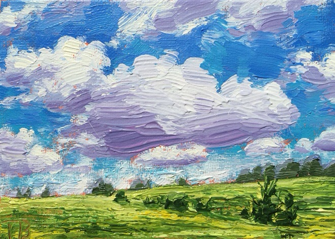
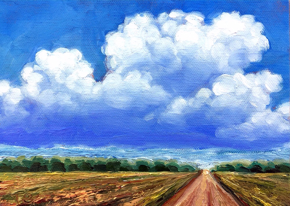
These clouds were a bit more complexed formation than the clouds I tend to emulate. I needed to add fresh paint to my palette, therefore it wasn’t as thick as the last painting. I need to start opening my palette a couple hours early for the fresh Golden Open Acrylics. Strange isn’t it! Although with the smaller clouds it wasn’t such a bad idea to have thinner paint. 5×7″ canvas board.

Beyond the Hill

image

Applied some of that thick gooey paint to finish up my painting. Incorporated the use of a palette knife. I want to do that more often. 5×7″ Canvas Board

“School Under the Trees” Final


I finished “School Under the Trees” this afternoon. 12″x16″ acrylic on stretched canvas. Will be auctioned to help raise money to build a school in South Sudan.


Detail of foreground.

“School Under the Trees” WIP3

image

Blocked out where there was too many leaves. Put in some of the background elements. Reworked the sketch in of the people. Might have to do more with all of that. Then I will work on the ground, and the picture has gallery edges.

image

Close up of detail

“School Under the Trees” WIP2

image

I painted the tree, the most challenging part of the painting. Painting the holes to shape the negitive space of the light coming through the trees is the final step of this part.

image

Here is part of the detail.

“School Under the Trees” WIP1

STree1

An underpainting for “School Under the Trees.” I illustrated a book about the “Lost Boys of Sudan,” used to raise enough funds to a build school in South Sudan. Construction will begin soon. 🙂

This is a painting I’m creating for their annual auction. Underpainting made with fluid acrylics, 12″x16″x1.5″ stretched canvas.

Warm Vs. Cold WIP2

image

image

1st is the blue underainting, 2nd is the red. The flower is not finished and I will do other adjustments. However subtle, even with opaque media there is a difference.

Warm vs. Cold WIP

image

I love color!!! Today, I’m doing an experiment with warm and cold underpaintings. The first is Cobalt Blue with gesso, and the second is Cadmium Red with a little Burnt Sienna. The grayscale photo shows they are of the same tone. I will paint the same lilly pads with flower on each. Hopefully I can post at least one of them later today.

Thunderheads 1 and 2

image

This is the first one I started yesterday.

image

And this the second, I did because I noticed my paint was thinner on the first one. I decided to try it again with my palette that had the thicker paint.
Both 6″x 8″ Canvas Board

Which one do you like better and why?