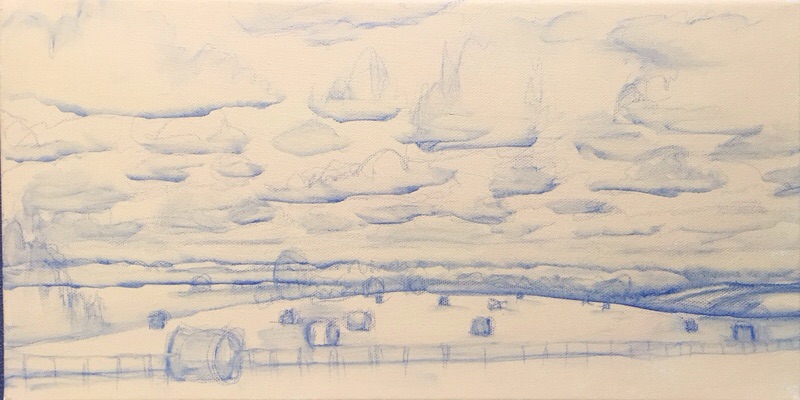
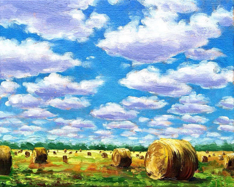
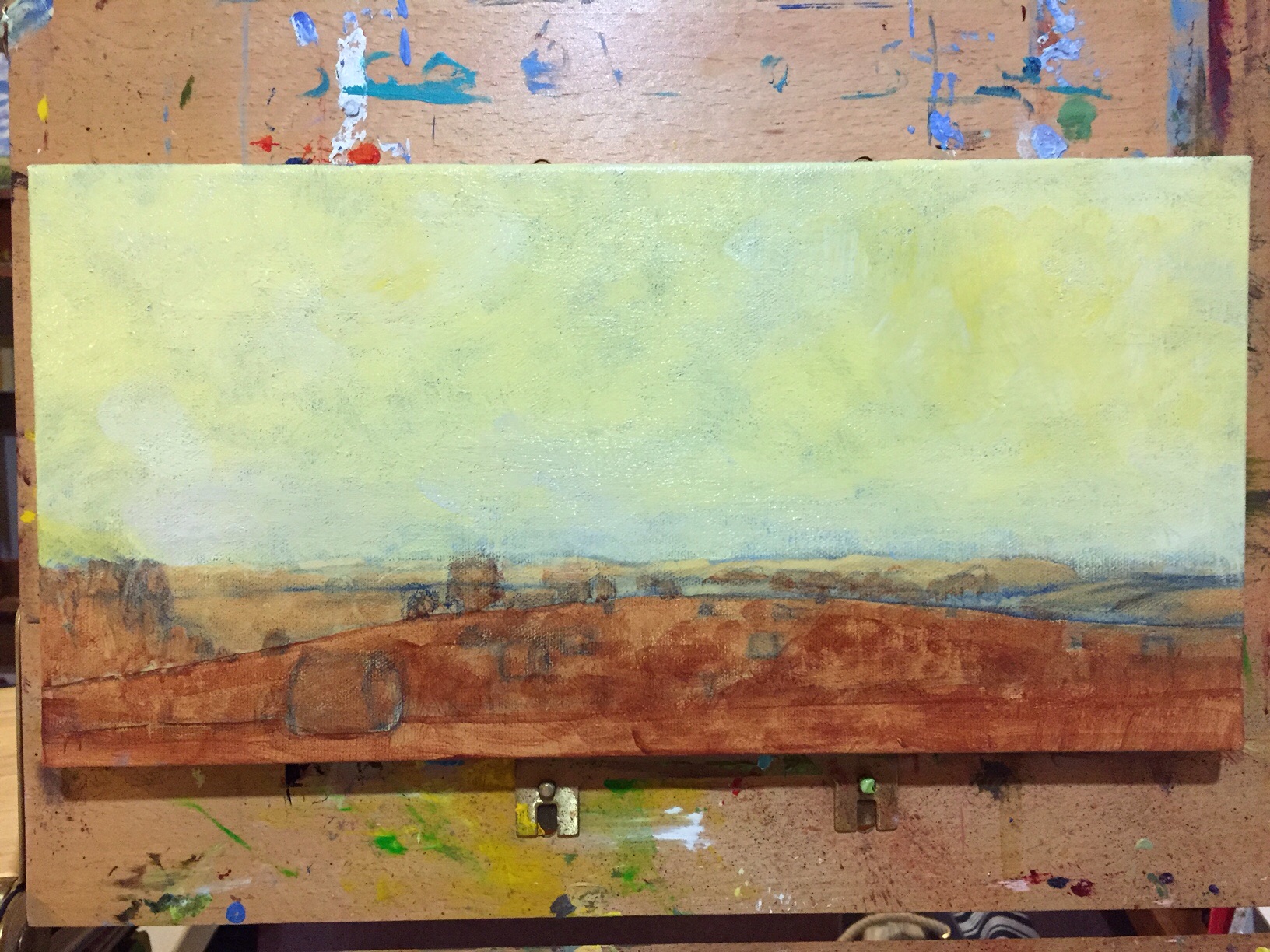
Well, I will boldy go forward by going backward. It’s 2:30am, for better or worse I blocked out my big sky. I had to do it now because I want it dry in the morning. I’m not content with composition of the clouds. It makes me cringe, but I’m taking the risk because I look at it and think about what I wish I would done. I’ll cross my fingers and hope for the best tomorrow!
Tag Archives: Painting
Rolling Up the Carpet #10 (WIP 1&2)
Painting Flowers for My Mom
Rolling Up the Carpet #9 (Actual Final)
Veil of humidity in “Rolling Up the Carpet #9”
At the horizon this picture needed something. It is commonly accepted that at the horizon there should be a fall off of colors, a veil of humidity to some degree, whether it is really there or not to add perspective and mood. I didn’t subdue the trees in the shelter belt enough. Here in the Northern Midwest, we don’t see it very often, and it was not present here, but I feel the effect should be added. The whole picture shouldn’t have the same intensity.
Just about everytime I’ve done Plein Air Painting, I’ve had to improvise on this effect. Our air is very clear! If I went southeast this wouldn’t be a problem.
Rolling Up the Carpet #9 (WIP 2)
Rolling Up the Carpet #9 (WIP 1)
“Rolling Up the Carpet” is the name I give for paintings of hay bails, although the sky is always of big interest to me in pictures of the plains. From our house we have a wide open view of the Southern sky. I’m especially watchful when thunderheads are developing.
8×10″ stretched canvas with gallery edges.
Ipad Painting
Since I have a cold, and didn’t feel like standing up to an easel, I decided it was time to give IPad painting a try from my comfy couch. I have tried out other paint programs, but was never completely content. I was inspired by the work of Janette Leeds of http://artandwordsjanetteleeds.com to try “Art Set Pro” on the iPad.
This painting is the same subject as one I did with real paint, except this time I did it from memory. It was the first thing that popped in my head. Clouds are one of my test subjects for new media. I use to make apples.
I found it was much like the real painting experience. I can paint somewhat like I do with real paint. I even picked some of the colors off a photograph of one of my paintings to get just the colors I use.
In many cases it’s nice to have the original painting, but I can see a real advantage for illustration, like a picture book. It comes out much better than a scan of a painting. Keeping consistency in colors through many pages would be easier. A print quality at 8×10″ 300 dpi can be achieved. I think I could go a little bigger.
There is also the advantage of spontaneous play and doodling, and knowing that you aren’t wasting materials. I could use it like an oil sketch for planning big paintings too. It’s just good fun!
Thanks Janette!
Fresh Landscape Palette 003
It’s time to start fresh with a new palette. Since I have two of theses Mijello palettes now. I’m keeping this one just for landscape. I may never have to clean it again! We’ll see how that works out. I mixed the major colors I use. Then I will grab as needed and let it mix together on painting, or grab two colors at a time.
Here is a list of my preferences:
Essential palette colors- Colbalt Blue, Sap Green, Green Gold, Cadmium Yellow Medium, Titanium White, Yellow Ochre, Burnt Sienna, Quinacridone Magenta
Extras- Ultramarine Blue, Cerulean Blue, Teal, Green Medium, Cadmium Yellow Primrose, Naples Yellow Lt, Red Oxide, Van Dyke Brown
I’m not one of those limited palette kind of people! 😀 To each his own!
A Bloomin’ Begonia
Donated Paintings
Our local Art Center http://brookingsartscouncil.org/home hosts an exhibit to raise funds by asking local artists to create up to 4 of 6×6″ works of art of any media. Patrons buy as many chances for a drawing as they like. At the time of the sale, they draw tickets, and each person comes up as their ticket is drawn, and has 30 seconds to pick a painting. The paintings are only signed on the back, so you have to pick by taste, instead of by name.
Here are two paintings I picked out at the last sale, painted by my friends. I can recognize their work, but I picked them because I liked the pictures.
Painting on left by John Rycharik, and on right by Steve Randall. Thanks guys, I’m proud to own art by your hand!


